
How to Read Your Equity Curve: The Window to Your Trading Soul
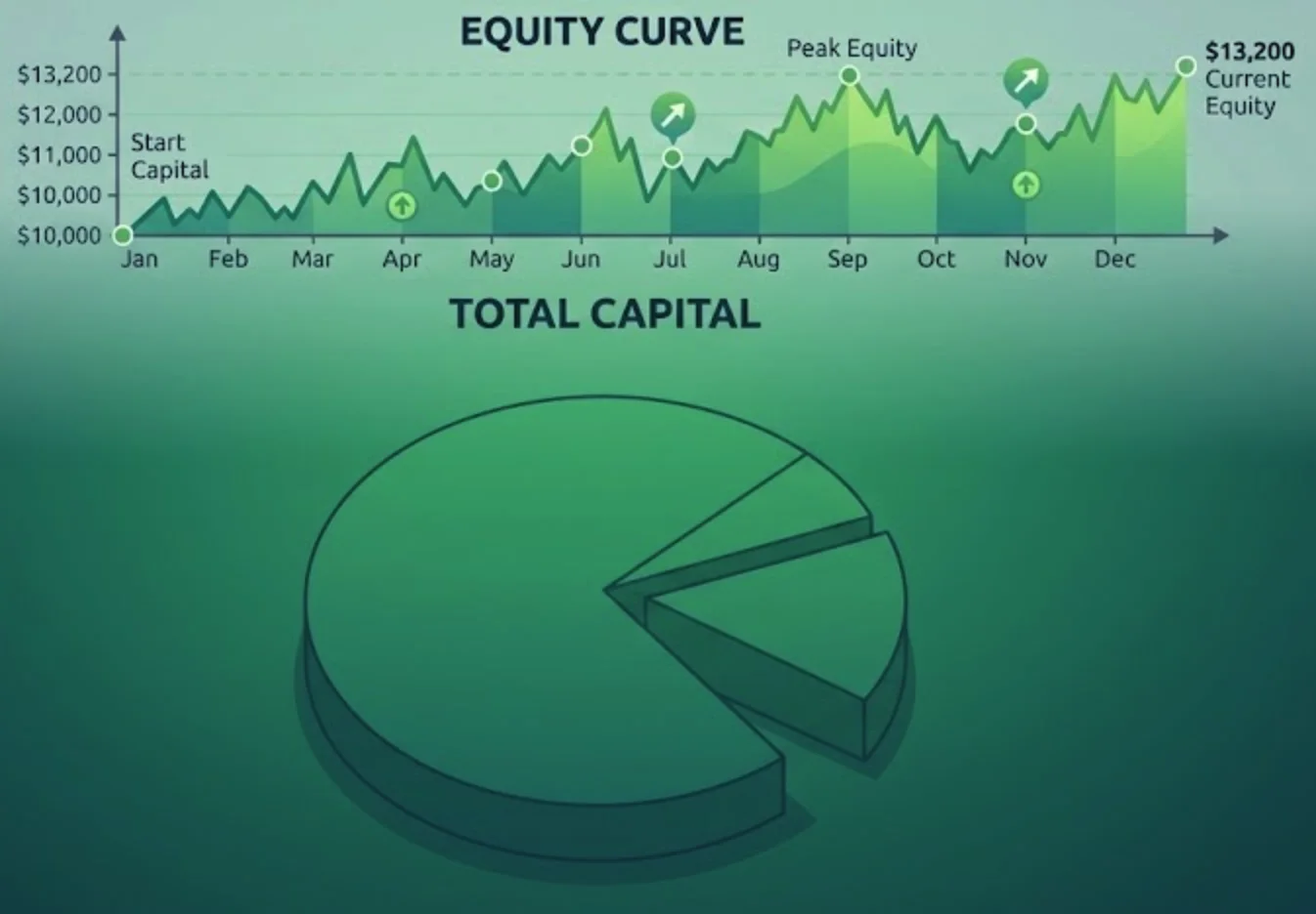
Picture your trading account balance plotted on a graph over time. Up and down it goes, like a heartbeat. That line — your equity curve — is arguably the most honest feedback you'll ever receive as a trader.
It doesn't care about your ego. It doesn't care about your excuses. It simply shows the cold, hard truth of your performance.
1. What is an Equity Curve?
An equity curve is a simple line chart that plots the cumulative profit or loss of your trading account over time. Each point on the curve represents your account balance after a specific trade or at the end of a trading day.
- Upward slope: You're making money.
- Downward slope: You're losing money.
- Flat line: You're breaking even.
2. Why Your Equity Curve Matters
It reveals the real story of your performance, highlights drawdowns, measures consistency, and keeps you accountable.
3. Reading the Signals: What Your Curve is Telling You
The Smooth, Steady Climb
The holy grail. Small, controlled dips. Keep doing what you're doing.
The Erratic, Jagged Zigzag
Sharp ups and downs — emotional trading. Review your position sizing and discipline.
The Steep Climb Followed by a Steep Fall
The classic "blow‑up" pattern. Reduce your risk per trade immediately.
The Flat, Inactive Curve
Not trading enough, or waiting for "perfect" setups. Review your strategy's opportunity frequency.
4. The Anatomy of a Healthy Equity Curve
Controlled drawdowns (10–15%), consistent upward momentum, recovery from drawdowns, and no extreme outlier trades.
5. Diagnosing Strategy Problems with Your Curve
Is the curve flattening out? Are drawdowns getting deeper? Is the curve becoming more erratic? Are there sudden, sharp drops?
Pro tip: Track your equity curve alongside your trading journal. Laxarr's analytics dashboard automatically generates your equity curve from your journal data.
Conclusion: The Curve is Your Compass
Your equity curve is your trading compass. It tells you whether you're heading in the right direction, and if you're not, it shows you exactly where the journey went wrong.
Ready to see your equity curve in action?
Laxarr automatically generates your equity curve from your journal data. Start tracking your performance today.
View your analytics